A Rant and a Drawing Lesson

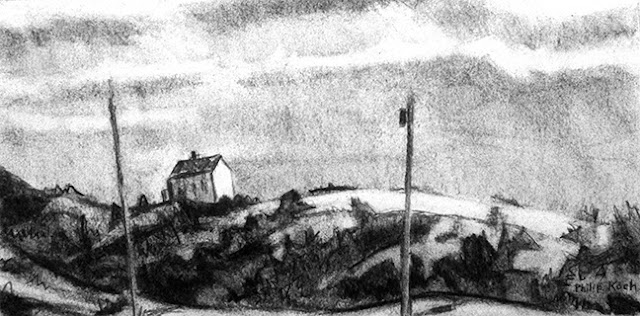
Philip Koch, Penobscot Bay, vine charcoal, 9 x 12", 1998
Pictorial Unity. Such a dreadful, anemic sounding phrase my eyes are starting to glaze over just hearing it.
It is murder to put into words exactly what it is artist do when they paint or draw well. The reality behind the phrase pictorial unity though is red-hot with meaning. Any successful art piece marshalls its forces like a team of horses to pull the wagon in the same direction. I was looking at the latest Art in America magazine this morning had to wince. More than a few of the paintings, installations, etc. they reproduced tended to visually fall apart. To use a popular phrase, it's a pandemic. Attention artists! The pieces in your work are supposed to engage each other in a meaningful conversation, not ignore each other or try to out shout each other.
Why is this so? It's because life itself so often is a fractured experience that humans are drawn to art and music in the first place. We have the chaos part down pat, it's something else we're looking for when we turn to art. Even if harsh conflicts are the artists' subject, artists have to demonstrate they are in charge of the contrasts and disjunctions instead of being ruled by them.
Nor do we need a phony "unity" of overly homogenized, over-generalized forms. Too much unity and the piece becomes a bore. What's needed is a means to overcome centrifugal forces that turn so much contemporary art into a muddle. Here are two of my vine charcoal drawings that illustrate two ways of thinking about creating unity.

The first drawing, Penobscot Bay, uses what I call the bed of tones technique. It begins by covering the entire surface with vine charcoal and then rubbing it in with one's palm to produce an all over middle grey. Then using a variety of erasers, whites are pulled out of the greys. The beauty of this method is it always produces a unified drawing where an atmosphere wraps itself around every form.
But it comes with a danger- it can make the artist too cautious with a mechanically heavy atmosphere. The highlights can end up a bit too dark and the darks a touch too middle grey. With this method, watch out for dreary.

Philip Koch, Tall Pine, Otter Creek, vine charcoal, 9 x 9"
2003
The second drawing, Tall Pines, Otter Creek, was done directly onto the paper's white surface. One can see the greater tendency of the forms to want to pull away from each other. To control this the artist has to be a little militant in enforcing their compositional ideas onto the drawing. In this example you can see how I've created a chain of darks that march across the middle of the composition from one side to the other. When I use this second method, I still try to use the bed of tones technique in at least a small section of the drawing.
Sometimes I use one of these methods to draw and sometimes the other. Switching back and forth keeps you on your toes. The same issue comes up in oil painting when one must choose to paint on a toned ground or on a pure white surface. Again I think it best to alternate between using both methods. Each has something different to teach us.