Good Advice from Matisse

Philip Koch, Red Trees, pastel, 8 1/4 x 6 1/2"
1997
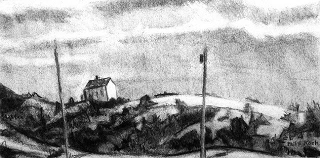
Here's a drawing of particular importance to me- one of the first pastels drawings I ever did that satisfied me. It began as a vine charcoal drawing done on location just north of Houston where I was staying with the very fine landscape painter Chris Burkholder. It's a stand of trees just outside his house. Late in the winter afternoon the sky had taken on a subtle yellowish glow. Vine charcoal, so lovely for capturing form and atmosphere, is a bit out of its depth when it comes to color. Since color was so much a part of how I felt out in the field that afternoon, I decided to risk adding soft pastel on top of the charcoal.
There is no drawing medium that led to as many bad drawings as pastel- the stuff is like a drug and can take over a picture faster than you can snap your fingers. I wonder if the manufacturers secretly slip some kind of narcotic into it.
There's a story that years ago some art students approached Matisse and asked him to teach them to use brilliant color as he did. Matisse replied that they should do as he had done- go to the Louvre Museum and spend everyday for two years copying old master paintings and drawing using charcoal. His point was that one can't separate hue out from the shapes and tonalities on a painting. They have to be married, and it has to be a good marriage.
My graduate school experience was more positive than most. One of my teachers, James McGarrell was a surrealist oriented figure painter who used lavishly inventive color combinations drawn out of his head. One of the best singe things he told me was "If you get the tones right, any darned color will look good." Sure it's an overstatement, but a useful one.
I have a fantasy that we artists could be born with an on/off switch for our ability to see color. You could just hit the "desaturate" button on your neck and see how your idea presents just in monotone. If it looks good, click the color switch back on and go to town.
For me using pastel effectively means using it in combination with vine charcoal. The two media help each other out- the charcoal always calling for the restraint of greys and offering the beauty of effortless gradations of tone and the pastel always wanting to pour another cup of over-caffeinated coffee into the mix. They make a good team, each speaking to a different side of the artist's personality.